

For this project we were diving into cereal. We were giving Kellogg's Rice Krispies to essentially study and make something of our own. Our instructions were to not rebrand it, but instead redesign it. We were given the text and images that were required to be on the box. Also to explore analog methods of expressing information, persuasive, and poetic forms of expression. Which can be seen on my dropmark.
Practical expression
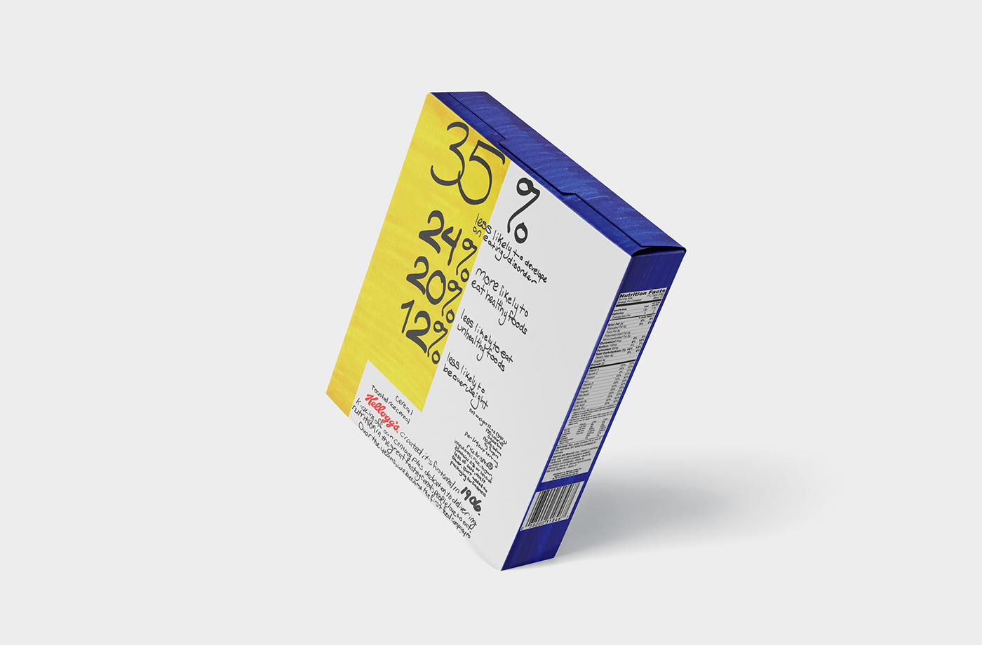
I wanted to do simple color blocking with big bold numbers and information provided in the text. With my professor's suggestion I used colored paper, only I had to color it myself with ink. For the numbers I used an oval brush in photoshop since I feel that can highlight my cursive-ish hand writing.


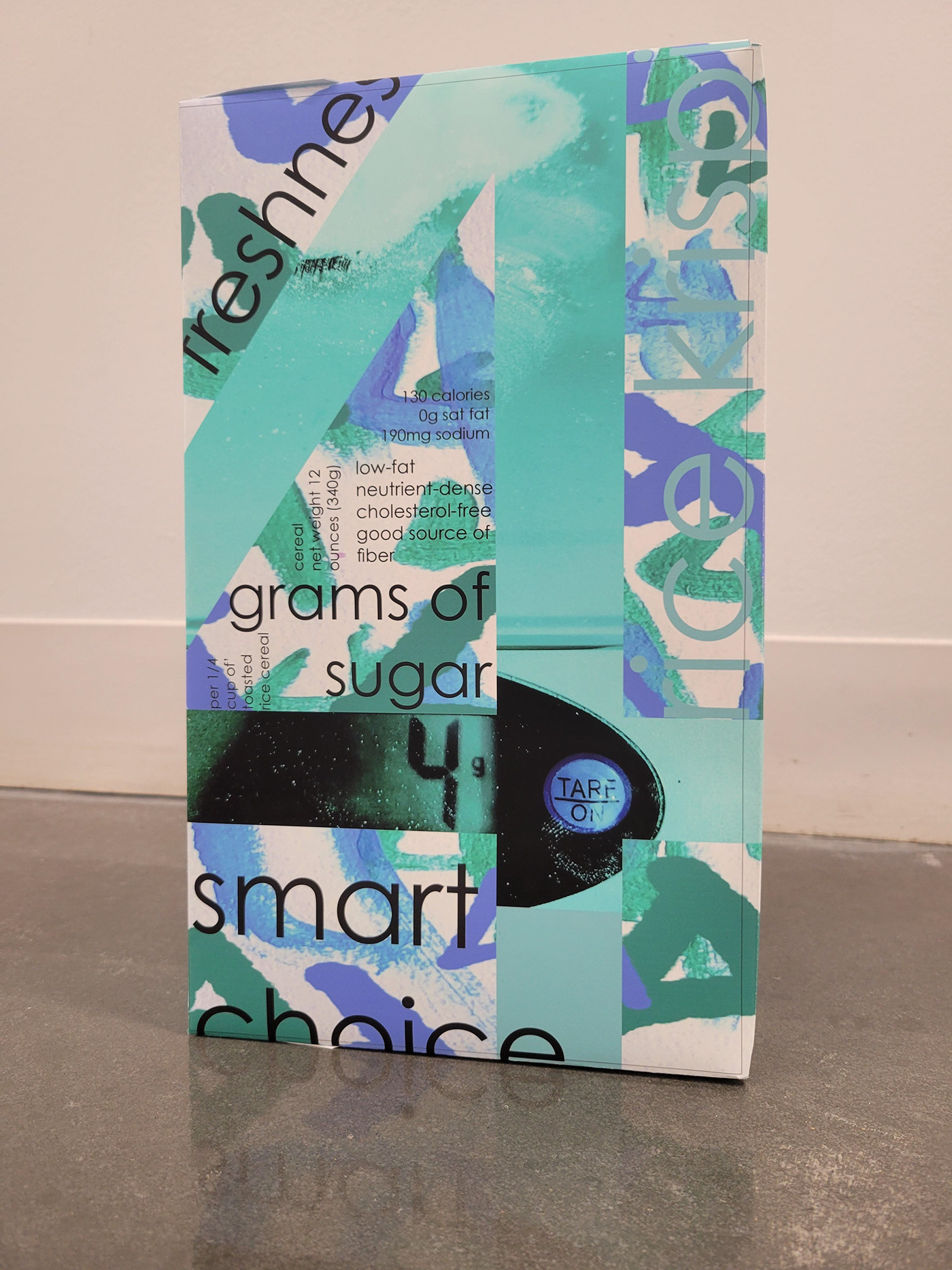
Persuasive expression
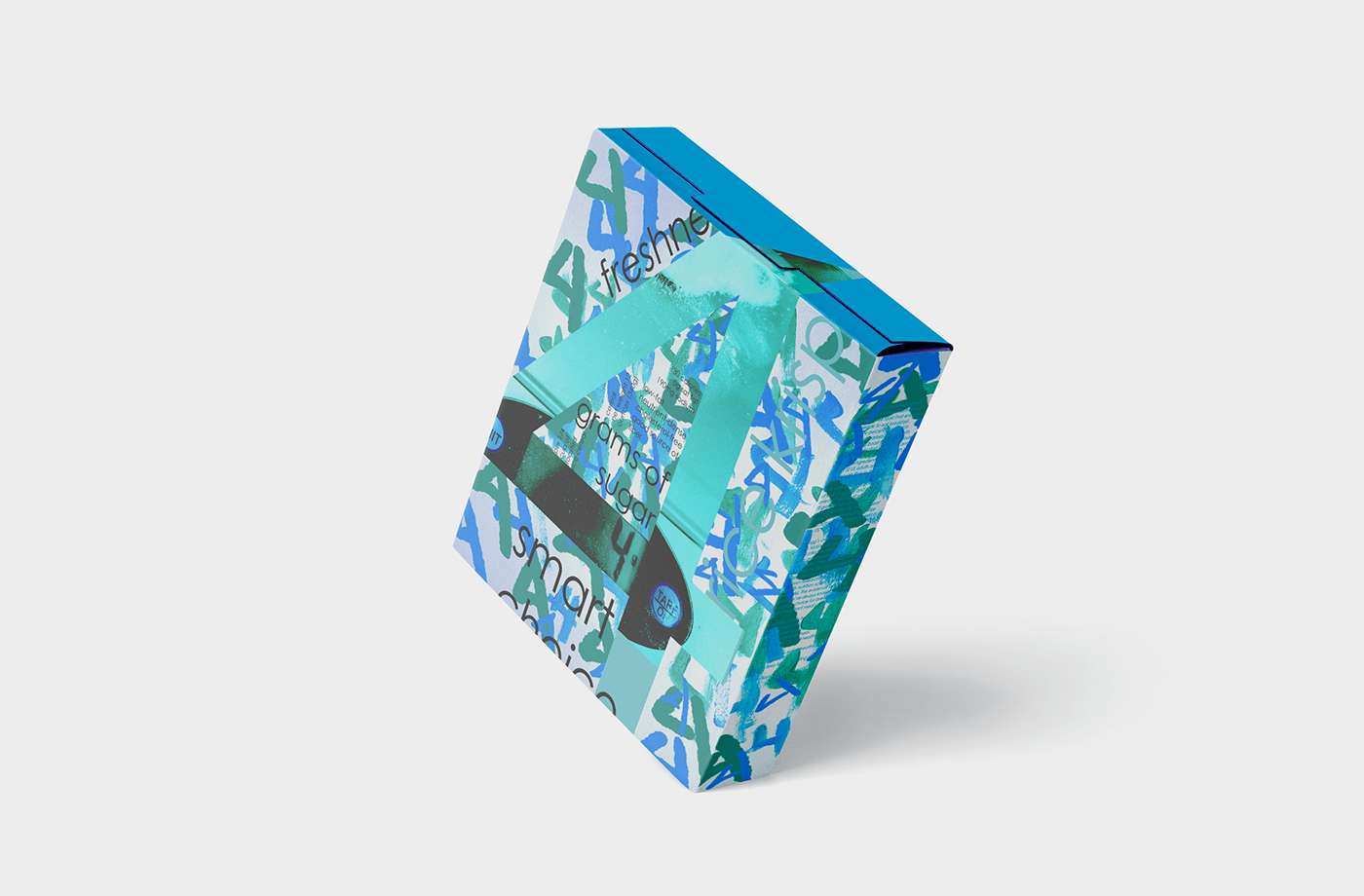
This was an interesting one for me to dive into. After all it can tip into a poetic form, in my case, one that comments on the diet industry and our need to count every thing. However, with my constant emphasis on the number 4 I feel it is leaning into the fact there is only 4 grams of sugar. You should buy it because it only has 4 grams of sugar. Creating all the 4s was two processes, one was just painting 4. The other was meticulously weighing out sugar on my family's old kitchen scale.


Poetic expression
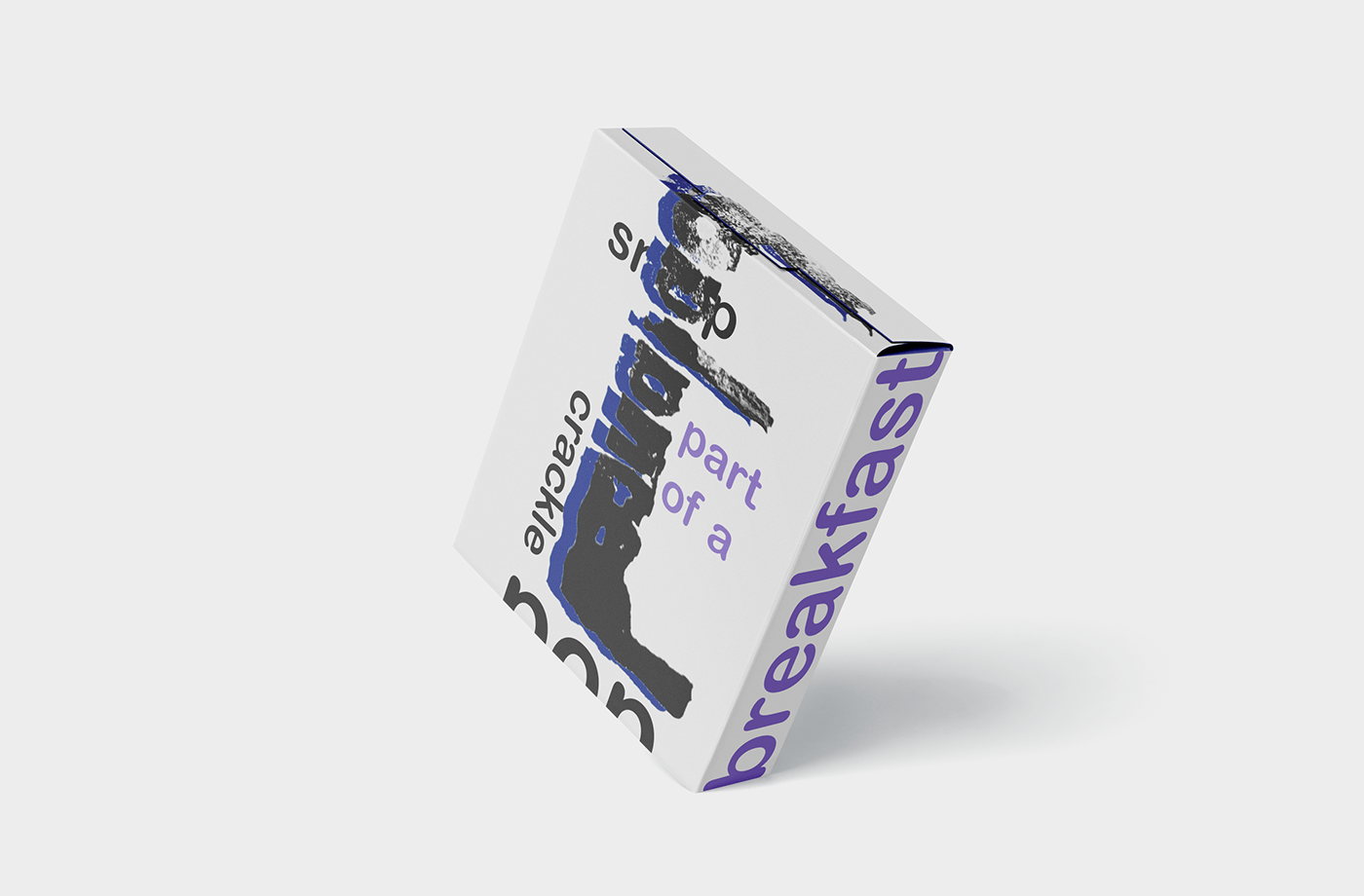
For my last box I wanted to make a simple to say statement "Life is about balance, but it's really hard to find that." So while this box doesn't exactly scream balance and perfection I believe that really reflects on how life is. To create the word balanced I dug out my stamp kit and carved out the word. Even though it was difficult to get the word to be legible I found the texture the stamp gave was nice.


For the deliverable we were to print and cut out one of our boxes. I chose the persuasive because of it's neon-ish colors and because it's probably my favorite.


